Choosing between a cap that looks good and professional and one that looks distorted will depend on 3d puff digitizing. When you are dealing with 3D Puff Embroidery, the use of foam, thin strokes, and rejection of the sample caps is critical for success. Embroidery Lettering requires knowledge of what works, what doesn’t work, and how to avoid risky artwork before putting it on the machine.
Why Font Choice Makes or Breaks Puff Lettering
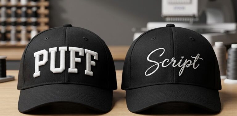
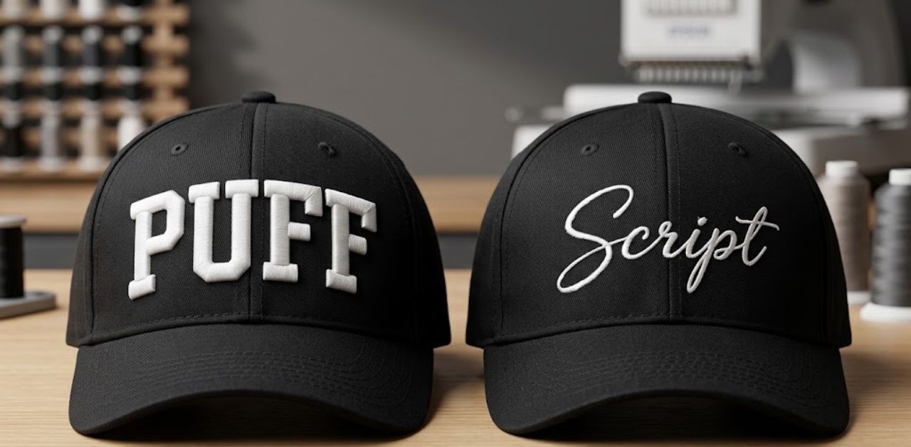
If you need to know why script and thin fonts do not work in 3D puff, then you need to consider the mechanics of the medium. Embroidery is usually done on a flat surface, but 3d puff embroidery digitizing entails using a thick foam (usually 2 – 3 mm in thickness) beneath the satin stitch. Since the threads should fully cover the foam beneath, the selection of your Embroidery Fonts and 3D Puff Embroidery needs to consider practical considerations.
Foam needs large, consistent areas. A stroke that is too narrow will penetrate and cut the foam rather than bridging over it, tearing or showing the foam through improperly. Furthermore, cap front panels are small and curved, which means letters need vertical height and open spacing to stay readable. To learn more about this trend, read our guide on why puff is booming.
Quick Pass/Fail Table: Fonts at a Glance
When evaluating Embroidery Fonts for your next hat order, reference this quick breakdown to save time and prevent costly embroidery samples.
| Font Style | Example | Verdict | Min Height | Why |
|---|---|---|---|---|
| Collegiate Block | Varsity-style | Pass | 0.35″ | Thick, uniform strokes |
| Heavy Sans | Impact / Arial Black | Pass | 0.25″ | No thin joins |
| Condensed Display | Anton / Bebas Neue | Pass | 0.25–0.30″ | Fits long names on caps |
| Slab Serif (Bold) | Rockwell Bold | Conditional | 0.35″ | Serifs must be thick |
| Script / Handwritten | Pacifico / Brush Script | Fail | N/A | Hairline connectors |
| Thin / Light Sans | Helvetica Light | Fail | N/A | Strokes may be too narrow |
| High-Contrast Serif | Times / Didot | Fail | N/A | Thin parts can collapse |
| Outline / Inline | Decorative fonts | Fail | N/A | Foam can’t fill channels |
Note: Minimum heights are general starting points. Final results depend on font construction, foam thickness, stitch settings, fabric, and cap curvature.
Fonts That Work: 5 Safe Picks for Puff Lettering
Successful puff embroidery digitizing starts with choosing typefaces built for physical elevation. Below are five fonts that always produce clean output when applied to structured caps:
- Collegiate block: The best font for team caps, varsity jackets, and other merchandise from the school. It provides a classic bold raised appearance with consistent stitch angles.
- Impact / Arial Black: Great choice for minimalist street fashion brands and punchy text where there is little room, but you need big impact.
- Anton: A fantastic free commercial-use option for startups. Its clean, condensed lines hold foam firmly without crowding the hat panel.
- Bebas Neue: Perfect for modern streetwear and longer words. Tip: Because it is narrow, always add slightly wider letter spacing so stitches don’t bunch up over the foam.
- Bold slab serif: The only serif style that survives puff work. With robust, blocky feet instead of delicate hairlines, it brings a heritage look to caps. (This answers the common question: Can serif fonts be used for 3D puff embroidery?)
Verdict: If you are unsure which typeface to choose for your logo, always start with a heavy sans or block face.
Fonts That Fail: 5 Typefaces to Avoid (and Why)
Not every pretty font translates well to three dimensions. When you are transferring your vector art files to 3d puff embroidery digitizing services in the US, try to stay away from these types to keep them intact:
- Script & Cursive: Hairline connectors immediately tear through foam, giving letters a rough and disconnected look.
- Thin & Light Sans: Delicate lines are unable to hold the foam, resulting in it tearing through the stitch columns.
- High-Contrast Serifs: Typefaces like Didot or traditional Times feature dramatic shifts between thick downstrokes and razor-thin serifs. The thick parts rise while the thin parts sink and disappear.
- Outline & Inline Fonts: These decorative designs carve channels into the letters. Foam cannot expand properly inside narrow split channels.
- Tiny-Counter Faces: Letters with enclosed or cramped interior spaces (such as compact e, a, 8, 9, and 0) rapidly fill in and become illegible forms.
Pro Tip: When working with a client who is insisting on having a very fine script font, vector redrawing is always required for thickening strokes. To avoid common pitfalls in other styles, review our breakdown of common digitizing mistakes.
How Digitizing Rescues (or Can’t Rescue) a Font
Skilled 3d puff digitizing can perform wonders, but it operates within physical limits. A professional digitizer knows how to control density, set pull compensation, make neat tie-offs, and program precise foam stops. However, even top-tier embroidery digitizing services cannot save a font if strokes are narrower than what the foam can physically support.
Before submitting artwork, check your design against this quick checklist:
- Are the stroke widths at least 2mm to 3mm thick?
- Is the letter height meeting minimum size requirements?
- Are enclosed letter counters open enough to breathe?
- Is letter tracking wide enough to prevent thread crowding?
Explore more about our professional capabilities with our puff digitizing service and specialized cap digitizing.
Minimum Letter Height and Stroke Width Guide
Mastering successful puff embroidery digitizing requires adhering to strict dimensional rules. Since foam is a physical material, crowding of letters immediately reduces its legibility.
- Recommended Letter Height: At least 0.25″ to 0.35″, depending on the weight of the entire font.
- Recommended Stroke Width: About 2mm to 3mm minimum width for satin columns.
- Recommended Height for Caps: At least 0.5” tall for all capital lettering to maintain legibility from a distance.
- Golden Rule of Thumb: If your layout cannot be enlarged to satisfy minimum requirements, minimize your word count instead of decreasing the font size.
Fixing Small Counters in Puff Designs
When a font features cramped interior spaces, including the inner area of the letters “e,” “a,” or “g,” the foam will be squeezed into a pucker. Here are four ways to fix your problem:
- Enlarge the letter or reduce the word count: Allow your tightly spaced letters enough room to exist on the cap panel.
- Switch to an open-counter, wider typeface: Choose a sans serif typeface that is open and has large interior areas.
- Thin the stroke slightly to open the counter: Adjust column widths just enough to clear the inner hole without dropping below the 2mm minimum threshold.
- Stitch tiny counters flat or remove foam: Let your digitizer program small interior details in flat embroidery while keeping the outer letters raised in puff.
Get Your Puff Lettering Digitized Right
Ready to bring your raised caps to life? Send your designs, fonts, or hat samples our way and have our 3d puff digitizing services at Infinite Digitizing produce your files that work perfectly in your embroidery machine. Enjoy perfect lines, proper foam coverage, and no guessing game on the shop floor.
Final Takeaways
Getting good at 3D puff embroidery means working within the physical capabilities of the foam. Using big and bold fonts such as block or sans-serif fonts instead of scripts will make sure that all caps are always professional-looking. Don’t let bad font selection jeopardize an entire production run of embroidered caps.
Partner with Infinite Digitizing for expert 3D puff digitizing that turns complex typography into flawless, professional headwear with zero guesswork.
FAQs
1. What are the best fonts for 3D puff embroidery?
A: The best choices for 3D Puff Embroidery are heavy, uniform-stroke typefaces like Impact, Anton, Bebas Neue, and collegiate block letters that provide a solid surface to trap foam.
2. Why do script and thin fonts fail in 3D puff?
A: Script and thin fonts fail during 3d puff embroidery digitizing because their narrow strokes and hairline connectors act like a perforation tool, slicing the foam instead of covering it.
3. What is the minimum letter height for 3D puff text?
A: For clean Embroidery Lettering, keep letter heights between 0.25″ and 0.35″ as an absolute minimum, though 0.5″ or taller is ideal for cap fronts.
4. Can serif fonts be used for 3D puff embroidery?
A: Most serif Embroidery Fonts fail because their thin horizontal lines and delicate serifs collapse, but heavy slab serifs can work if their strokes remain thick.
5. How do you fix letters with small counters in puff designs?
A: During puff embroidery digitizing, you can fix tight counters by enlarging the text, switching to an open-faced font, or programming the machine to stitch small internal loops flat without foam.